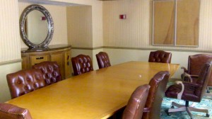
 You can have the best management team but if your meetings are lousy, then you may want to blame the room. The truth is that most meetings spaces are designed more for Downton Abbey type dinners than meaningful work.
Maybe you don?t mind spending countless hours in dull discussions that rarely produce meaningful decisions. As readers know, I?ve tackled some of the distractions that people can bring to your meetings. Now let?s Clear the Path of some of design challenges that limit your meeting?s productivity.
Ditch the Designer
Designers and those in your office, who want to be designers, are probably filling the room with furniture that fits from an aesthetic point of view. This doesn?t mean that there is any consideration of productivity.
A big, long table, looks very impressive but it can make communicating very hard. The larger the table, the more likely side conversations will break out. Then your meeting may devolve into people asking, ?What did the person, on the other side of the room, just say??
In a large space, those who speak the loudest are given a much higher share of attention. Your quieter and more thoughtful people will fade into the background, when seated at a big table.
Before you buy furniture, make sure that the people who will be in the meetings are consulted for their thoughts. They may have experiences that will positively influence your buying decisions.
Showroom or Workroom?
Too often a meeting room shares purposes. Is it a place where work gets done or is it a client showroom? It rarely can effectively be both.
Thought and discussion can be an understandably messy process. Wooing a client requires cleanliness.
If you feel like plastic should go on the furniture of your meeting space, then it?s probably not a good spot for solving your biggest problems. Consider a separate area for client meetings.
Can You Move and Groove?
Many meeting spaces are designed for everyone to be seated. That?s great for eating at a restaurant but not for meetings.
Is the table so big that it is very hard to move around? Is there room for overflow seating? If you use white boards, can people easily get to them? These are questions you need to consider.
Keep in mind that most meeting rooms are designed like they were 100 years ago. Today?s technology requires extra space and different sight lines. Something is wrong if you need to push away from the table in order to see the Powerpoint.
Redesigning your meeting space may seem costly but how much are you currently losing in productivity? That may make you want so sit down.


